New Year, New Goals: Update

Well, I've been pretty shit really at following through with my resolutions.  

My biggest failure so far is that I haven't worked on the graphic novel. At all. I started working on page one and immediately got overwhelmed. I really should have paid more attention to the perspective lessons in college. My first panel should be a big, beautiful shot of a castle amidst mountain peaks, a highly-detailed three-point perspective piece that will set the visual tone for the rest of the graphic novel. So far I have...a horizon line. 

But it hasn't been all bad. I just finished a new painting that I'm quite proud of (you can see it in my Personal section). 

In addition,  I've started setting up my online store & populating it with products. So far I have a few originals & prints of my more favorite pieces. The hold up with officially opening? Taxes & legalities. Sales tax is complicated, folks. But, with any luck, it will be open by the weekend!

New Year, New Goals

I love that our society has built into the coming of the new year a time for reflection & resolutions. The beginning of the new calendar year is a time to start afresh & try to become a better person than you were the year previous. I think that's pretty damn beautiful. 

So, it being New Year's Eve, I thought I would share with you some of my goals for the coming year...


ART GOALS

1. My BIG ONE: Finish the graphic novel. I did some number crunching & if I can do one page of script a week, the graphic novel is done in a year. I really hope it doesn't take me one whole week to do one lousy page, but that's from thumbnail to sketch to paint/ink to final. I may be a little shit out of luck with parts of this (ahem, lettering), though.

2. Get more art in more galleries. This could be art shows or it could be consigned artwork. I was also speaking with a friend today about setting up a table for Biddeford/Saco's monthly Art Walk. That would just be so much fun even if we didn't sell a single thing.

3. Set up my online store. This website has an online store attached as part of my subscription, I just have to set it up & populate it. That's the point of this website, right? Become a working artist, transition away from day job to night job. 

4. Do art daily. Can't be an artist if you're not making art.

5. Blog regularly. 

6. Post to Instagram regularly.

I have some other goals as well about health/diet, budgeting & paying off the ol' student loan, & spirituality. But I won't bore you!


Info about the Art Walk

"Awesome" News!

My work is up for sale at Awesome Hobby Shoppe in Biddeford, Maine! I will be selling some of my work through them for the foreseeable future.

The exterior of Awesome Hobby Shoppe. That's a statue of Jason in the window.

The exterior of Awesome Hobby Shoppe. That's a statue of Jason in the window.

Last week was a real whirlwind!

One of the goals I set for myself for this year was to get into galleries. I'd seen artwork up in AHS while walking the dog & finally decided to stop in a couple weeks ago & see how to get art there. I was told to contact their art director, Mike, & left them my name & website. (Mind you, I had absolutely nothing to show for my intentions outside of curiosity. Oops!) He got in touch with me shortly after Thanksgiving. After meeting Mike in person on the morning of the third, I've been cranking out original artwork.

I'm selling prints & a handful of originals. I hope to also open my online store here shortly as well, since I'll be getting prints made anyway. 

ALSO...I've been invited to be part of AHS's first show in 2017: Kickflip'd. It's all art on skate decks. I'm stoked. If you listen to Chat-Man & Robin you've already heard I'm going to make a pussy-board. We'll see how it goes. Kickflip'd is set to run February 1-16th. I'll post info on the opening reception, if there will be one.

Check out Awesome Hobby Shoppe on Facebook.

The artwork to the right of mine is by Elizabeth Carmella.

The artwork to the right of mine is by Elizabeth Carmella.


My Artistic Process & Symbolism: Skyclad Witch Painting

PROCESS

I thought it might be nice to do a break down of how I work through a painting from concept to final product as well as explore the symbolism in a painting. I've already broken down the symbolism in the Grant Morrison piece on the latest episode of Chat-man & Robin, Episode 28

I didn't get photos or video of the process of painting itself. I was feeling a little self conscious about this piece (still am), but I can walk through how I laid the paint & ink down.  

Witchrough.jpeg

This rough sketch was drawn from a reference photo I took of myself. A few things were changed from the original photo, of course: longer, fuller hair, I evened out the level of the arms, left out my philtrum piercing & tattoos, made the drawing more cut & muscular...

You can see in this sketch I had a crescent moon on my forehead. I hadn't worked out the background imagery yet. Once I did, I swapped the crescent out for a rune 

At this point I laid the horizon line & vanishing point down. I used the lines from my reference photo to find these. Maybe it's cheating, but it took way less time! Once those were in, I drew in the candles working over some roughly sketched in ones. Next came the sacred circle. When I was happy with these things I cleaned up my guides. Then I threw in the trees. Last came the athame, apple, & the moon.

The moon stayed this size all the way through transferring the drawing to watercolor paper (I do this using graphite paper—it's very hard to get up once it's down, so you'll notice a faint small moon inside the final). I felt the moon was too similar in size to the apple & athame, so I made it larger. It helped to add some drama to the piece, too, so it was a good choice.

A candle study so I could better understand them.

A candle study so I could better understand them.

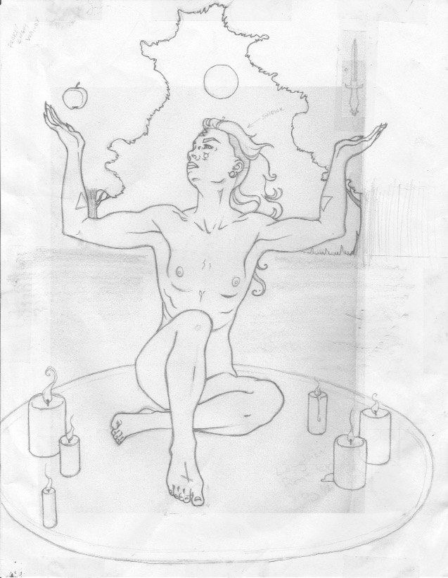
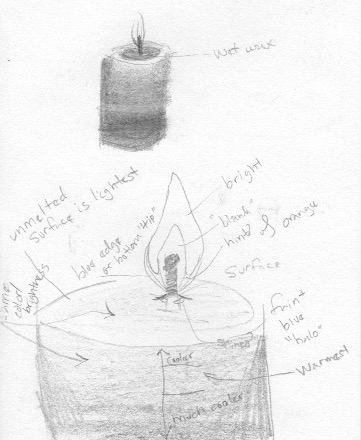
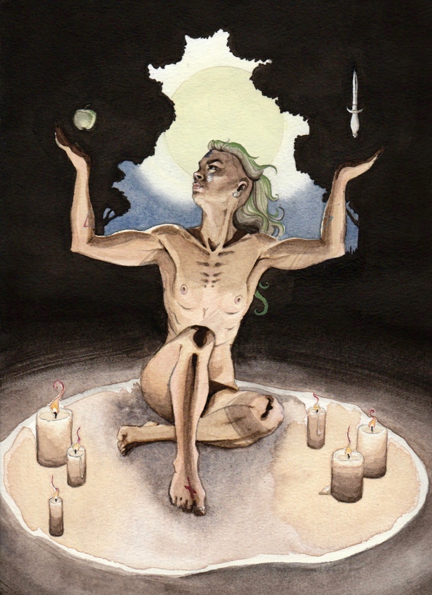
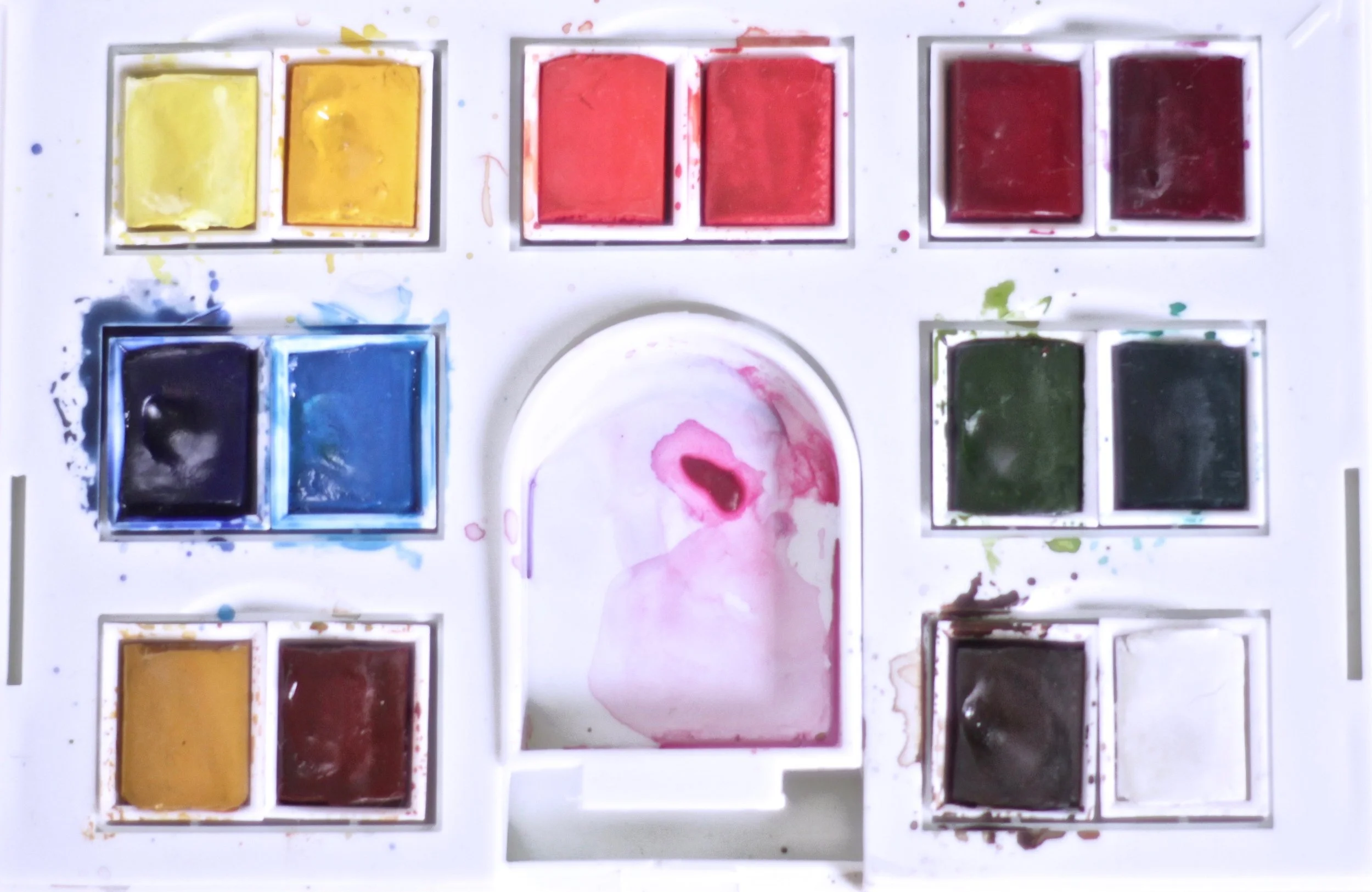
How I worked when laying in the paint is I started with a pale yellow wash over areas I knew would have some of this showing: the candles, ground, sacred circle, the body, moon/sky, areas of the foliage. Then I worked on the candles while I was waiting to take a reference photo of myself to see how the candles' light would create shadows. (I realize as I write this that I didn't include shadows cast the pillar of the candle itself. Shit.) Then came the witch working light to dark skin tones, then details like hair color, lip color, the runes & alchemy symbols. I painted the apple & athame at the same time as the witch. The sky & ground came next. Next to last came the ink was of the trees & background. This actually took a good chunk of time. Finally, fine details on the witch like gouache highlights & painting in the moon with tinted gouache. 

Symbolism

Like the Grant Morrison piece, I'm working in the same structures set up by existing religious (primarily Catholic) artwork. The arms raised by the witch were meant to be a harkening back to the Mother Mary's outstretched hands and also Justice personified. Balance, but also a calling down of the divine & of the feminine Moon. Her right foot is put forward in a symbolic placing of her foot upon the path of the spiritual journey.

Above her hands are an apple an an athame. I chose the athame first. Not only is it a common witch's tool, but I also used it to represent the phallic, the male. I needed another symbol to represent the female & what first came to mind was the apple. The apple is a very loaded symbol highly associated with the female & also with Eve, temptation, and knowledge. I was reading a short while before I chose this as my symbol in a book called Cunninham's Encyclopedia of Magical Herbs that I would highly recommend to anyone interested in herbology or green/hedge/kitchen witchcraft. 

Some symbols are incorporated. They are symbols primarily of intention. Working top to bottom: on the witch's forehead is the rune beorc/berkanan that represents growth & rebirth. It's meant to represent the beginning of a new way of thinking. On her left cheek is the symbol of Mercury, an alchemical symbol associated with the masculine as well as mental processes & communication. On her right cheek I imagine is the symbol of Venus, associated with the feminine as well as the physical: love & sexuality. Note: everything is line with the witch's left/right. Again, I'm working with balance. The balancing of the spiritual & the divine. On her arms are more alchemical symbols. These ones are or fire (left) & water (right). (Another realization as I look back at this...I accidentally reversed these symbols. They should be swapped to keep with the left/masculine & right/masculine side of the image.) Again, fire equals male, water equals female. On her extended foot is the last symbol, the rune nyd/naudiz that represents need, craving, or a desire. As mentioned above this is in reference to the spiritual journey. 

Three candles to a side are balance again. Also the number six is associated with the artist, responsibility, balance, generosity/humanitarianism & being community-oriented. All wonderful things to call into an act of dedication to witchcraft. Green, present in the witch's hair and the apple is associated with prosperity & fertility—in this case meant metaphorically in relation to her growing powers & budding spirituality. The plug seen in her earlobe is meant to be a moonstone, used for fertility as well as for spiritual growth, protection, & amplifying intuition.

My Current Art Stash

I thought I'd do a little show & tell of my current art supplies just for the hell of it. I'm always curious what other artists are using.  

I keep the majority of my stash in an old cigar box. I've meant for ages to pick up some balsa wood & make little compartments for everything. Maybe I'll do that this winter.  

I keep the majority of my stash in an old cigar box. I've meant for ages to pick up some balsa wood & make little compartments for everything. Maybe I'll do that this winter.  

First up: Liquid Leaf in Classic Gold & Silver. I haven't had an opportunity to use the silver in a piece of artwork yet.  

Next: Gouache in Permanent White. For highlights & shines.  

Next: Permanent Rose that I bought for mixing proper Caucasian skin tones.

Finally: An old perfume bottle I've had since college. It was a lemon verbena scent—I love citrus-scented things.  It's now used for misting paint, wetting the page, etc. 

Left: My Winsor & Newton travel set (Cotman, not Professional) that I have never taken outside. I also don't think I've ever used the brush that came with it.

Colors in this set: lemon yellow hue, cadmium yellow hue, cadmium red pale hue, cadmium red hue, alizarin crimson hue, purple lake, ultramarine, cerulean blue hue, viridian hue, sap green, yellow ochre, burnt sienna, burn umber, & Chinese white. I'm not very happy with the burnt umber. I use it to make blacks, grays, & shadows (along with ultramarine). I've found that it has a gritty, chalky texture. I think I'll be swapping it for sepia or Vandyke brown. I may also get an intense phthalo blue or indigo to create better shadows. Someday I'll upgrade completely to higher quality paints...

As a side note about creating skintones, this blog entry by Ella Jackson has been incredibly helpful to me. There are three other posts & worth a quick gander. 

Right: My mixing plates. They're two small panes of glass from some frame I bought at Goodwill in college & taped the back & edges with masking tape. They live under a thin piece of wood that's inside the cigar box almost like a false bottom. Secret spy shit.

My beautiful, messy set. It looks like I use ultramarine & burnt umber the most.

My beautiful, messy set. It looks like I use ultramarine & burnt umber the most.

Windsor & Newton illustration inks from my mother. Black, red, yellow, & blue. I've not used them very much, but I'd like to do some experimenting. I think I need some eyedroppers first, though, so I can be very methodical about my ink to water ratios.  

My main brushes are all the golden Taklon American Painter brushes by Loew-Cornell. 

My main brushes are all the golden Taklon American Painter brushes by Loew-Cornell

Left to right: a toothbrush for spatter patterns, a big, cheap 1 1/2 brush for washes, two 3/4 wash, 10 chisel blender, 6 chisel blender, 1/2 angular, 3/8 angular, 8 round, 1 round, 1 script liner, 2 filbert.

My most used are the flat/blunts, 3/8 angular, & script liner. I almost never use the round brushes. The filbert is almost exclusively used for transferring paint from the pan to palette.

I've had these brushes for probably two or three years and I'm quite happy. They were very reasonable & have proved to be extremely durable. I'm not particularly nice to them. I think I've only thrown one away & I've used them in frisket, the Liquid Leaf, & pure acetone (for cleaning the Liquid Leaf off). The bristles are nice: very soft & even. I can get a quite crisp line with them. Of course, being synthetic, they don't hold liquid as well as a natural hair brush, but it hasn't bothered me much. I think I'd like to try working more wet into wet & should pick up a couple sables. I should also pick up a teeny little round, liner, &/or angle for details & edges. Probably should have something in between 10 bright & my 3/4 wash, too, to be honest.

Ahh, my brushes. I love them.

Ahh, my brushes. I love them.

My water vessel is an old pickle jar. I'm really missing the old jar I had, but I recycled it when we moved. I'm not totally happy with my current water situation, so I'm keeping an eye out for a tall, sturdy jar. I also have masking fluid & a razor blade for cleaning off my palettes.

My paper choices are limited to 9x12 blocks exclusively. I don't have the space for the extra supplies (or patience, perhaps) for taping down pages. The blocks I currently have are the Strathmore 400 Series block & the Arches hot press block. I love the Strathmore block. So much so that when I found it on sale I bought three. It's an inexpensive, accessible, all-around great workhorse block. The treehugger in me likes that it's partly made with recycled fiber. The only drawback I've found is that you can't work over the same area again & again too roughly or scrape with a razor blade without creating an obvious mar. I've only used the Arches block once for a small series of landscape-type paintings. It's my first hot press paper & I'm not sure how I feel about it yet. I'd like to get the Arches cold press block. I've had people recommend it very highly (even to go so far as to ask me if I was crazy when I asked if it was any good). Sometimes the product is worth the hype & the higher price tag, sometimes it's not. Time will tell.


You know, it's funny, I never thought I'd be a painter. I couldn't stand acrylic & oil while I was in school & only really started experimenting with watercolor near the end of my schooling. I thought I'd be a pure graphite & maybe ink (in a pen or marker form only) artist with coloring of comics handled largely by someone else (I'm pretty terrible at digital coloring). But the physicality of painting is very rewarding, very meditative & I appreciate how quickly watercolor dries. 

Podcast News

Chat-Man & Robin, the podcast that I co-host with my husband, Max, is now up on iTunes!

This is something we've been wanting to do for a while so it would be more accessible to our listeners. Hosting it on his website really wasn't the easiest way to tune in.  I wish we'd known long ago how incredibly easy the iTunes review process was.  

For any newcomers out there, Chatman & Robin is a nerd & pop culture-focused podcast, though we do dip into social issues, politics, Feminism, gender/sexuality, & anything else we feel like discussing. Most of the time it's very light stuff. We have a lot of fun just sitting down & talking to each other. 

So, if a bit of nerdy fluff sounds right up you alley, we (TRY to) put out a podcast every Wednesday! 

It is the time for beginnings...

I've been meaning to set up a new website for a while. A place to host the art I'm working on now, things that are new & fresh. It took meeting someone my age & who's in a very similar place. She's an amazing artist. I saw her put herself out there at a recent show, putting things up for sale that she wasn't personally proud of, & knowing that she didn't lose money, but quite the opposite.

It all just seemed so silly: my fears, my concerns, my self-doubt. All it took was a body of work & a go-getter spirit! It's not really that easy, but at the same time...it is. Passion + Time = Success. Someone out there will like my art, even if I'm not 100% happy with it (which I'll never be anyway). I just have to find them. I have to put myself out there. I have to make as many connections as I can to find those people that want to buy my work.

A new website seems like a very good place to start. A logo & business cards will follow, as well as fleshing out the art pages on here. Updates will come on the progress of the graphic novel. I will do research & begin offering prints (& maybe originals)! And then some shows to add to my resume, some freelancing, some...

So, here's to new beginnings.